Severity: Notice
Message: Only variable references should be returned by reference
Filename: core/Common.php
Line Number: 257
Severity: Warning
Message: Cannot modify header information - headers already sent by (output started at /home1/murguz/public_html/system/core/Exceptions.php:185)
Filename: libraries/Session.php
Line Number: 688
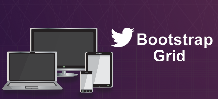
Here is my first tutorial about Bootstrap Grid System. So what’s Bootstrap? Bootstrap is a mobile first front end framework. It has really cool looking UI elements like buttons, dropdown menus, banner rotator as well as powerful Grid System which this post is about. If you are familiar with bootstrap you will notice that this website is also built using Bootstrap.
First let’s go to Bootstrap website and download latest version or just copy and paste Bootstrap CDN links. For this tutorial I am going to use CDN links. It’s a good practice to add CSS links in head section, but JavaScript files in the footer just before closing body tag. As without CSS files page will look ugly and unordered, but script is not essential to render page .We will need to add jQuery before Bootstrap JavaScript link. Also don’t forget to add viewport ‘meta’ tag to make sure scaling works for mobile devices.
Here is what we have so far:
<!DOCTYPE html>
<html>
<head>
    <title></title>
    <!-- Latest compiled and minified CSS -->
    <link rel="stylesheet" href="//maxcdn.bootstrapcdn.com/bootstrap/3.2.0/css/bootstrap.min.css">
    <!-- Optional theme -->
    <link rel="stylesheet" href="//maxcdn.bootstrapcdn.com/bootstrap/3.2.0/css/bootstrap-theme.min.css">

    <meta name="viewport" content="width=device-width, initial-scale=1">
</head>
<body>
    <!-- Latest compiled and minified JavaScript -->
    <script src="//ajax.googleapis.com/ajax/libs/jquery/1.11.1/jquery.min.js"></script>
    <script src="//netdna.bootstrapcdn.com/bootstrap/3.1.1/js/bootstrap.min.js"></script>
</body>
</html>
Grid system in Bootstrap can be thought as 12 column table which is displayed differently based on screen size. We can specify how many columns each cell will take for each screen type.
Bootstrap has 4 types classes to enable setting Grid Layout.
Each cell has 15px padding from left and right by default which can be easily modified with custom styling.
Bootstrap has mobile first approach that’s why first it looks for ‘col-xs-n’ class (n can be any number from 1 to 12). Then if screen size is bigger it looks for ‘col-sm-n’ class and so on. If it doesn’t find ‘col-sm-n’ it will use ‘col-xs-n’ for all types of devices.
As an example, if we place 4 ‘col-md-3’ div elements inside a row they will be shown as left to each other for Middle and Large Devices, but will stack on Small and Extra Small Devices.
I have added a little bit styling too.
<style>
    .container {
        padding-top: 20px;
    }
    .col-md-3:nth-child(even) {
        background-color: lightblue;
    }
    .col-md-3:nth-child(odd) {
        background-color: lightcyan;
    }
</style>
<div class="container">
    <div class="row">
        <div class="col-md-3"><p>.col-md-3</p></div>
        <div class="col-md-3"><p>.col-md-3</p></div>
        <div class="col-md-3"><p>.col-md-3</p></div>
        <div class="col-md-3"><p>.col-md-3</p></div>
    </div>
</div>
Click here to open in separate window. Resize browser screen to see how grid works.
If we add 2 more ‘col-md-3’ rows, total number of columns will exceed 12 and they will be shown on next line as shown below:
<style>
    .container {
        padding-top: 20px;
    }
    .col-md-3:nth-child(even) {
        background-color: lightblue;
    }
    .col-md-3:nth-child(odd) {
        background-color: lightcyan;
    }
</style>
<div class="container">
    <div class="row">
        <div class="col-md-3"><p>.col-md-3</p></div>
        <div class="col-md-3"><p>.col-md-3</p></div>
        <div class="col-md-3"><p>.col-md-3</p></div>
        <div class="col-md-3"><p>.col-md-3</p></div>
        <div class="col-md-3"><p>.col-md-3</p></div>
        <div class="col-md-3"><p>.col-md-3</p></div>
    </div>
</div>
Click here to open in separate window.
Let’s take look at next example:
<style>
    .container {
        padding-top: 20px;
    }
    .col-md-3:nth-child(even) {
        background-color: lightblue;
    }
    .col-md-3:nth-child(odd) {
        background-color: lightcyan;
    }
    .col-md-4:nth-child(even) {
        background-color: lightgoldenrodyellow;;
    }
    .col-md-4:nth-child(odd) {
        background-color: lightgreen;
    }
</style>
<div class="container">
    <div class="row">
        <div class="col-sm-6 col-md-4"><p>.col-sm-6 .col-md-4</p></div>
        <div class="col-sm-6 col-md-4"><p>.col-sm-6 .col-md-4</p></div>
        <div class="col-sm-6 col-md-4"><p>.col-sm-6 .col-md-4</p></div>
    </div>
</div>
Click here to open in separate window. Here we have both ‘col-sm-6’ and ‘col-md-4’ , which means browser will stack in Extra Small devices as we haven’t set cell width for them and will stack all elements. Then for Small devices only 3rd element will stack because total number of 3 elements is 18 (bigger than 12). Devices with Middle screen width will show all of them. Even we haven’t set classes for Large devices, they will still use the biggest available classes (which is ‘col-md-4’).
In the last example we are going to see how offset classes work:
<style>
    .container {
        padding-top: 20px;
    }
    .col-md-3:nth-child(even) {
        background-color: lightblue;
    }
    .col-md-3:nth-child(odd) {
        background-color: lightcyan;
    }
    .col-md-4:nth-child(even) {
        background-color: lightgoldenrodyellow;;
    }
    .col-md-4:nth-child(odd) {
        background-color: lightgreen;
    }
</style>
<div class="container">
    <div class="row">
        <div class="col-md-4"><p>.col-md-4</p></div>
        <div class="col-md-4 col-md-offset-4"><p>.col-md-4 .col-md-offset-4</p></div>
    </div>
</div>
Click here to open in separate window. Offset classes use similar structure as column classes: ‘col-xx-offset-n’. Just replace ‘xx’ with ‘xs’,’sm’,’md’ or ‘lg’ and ‘n’ with number from 1 to 12 , depending how many columns you want to offset.
That’s all for now, please let us know what do you think. More stuff coming soon.
July 14,2014
Admin
Category: Web Design
Rate: